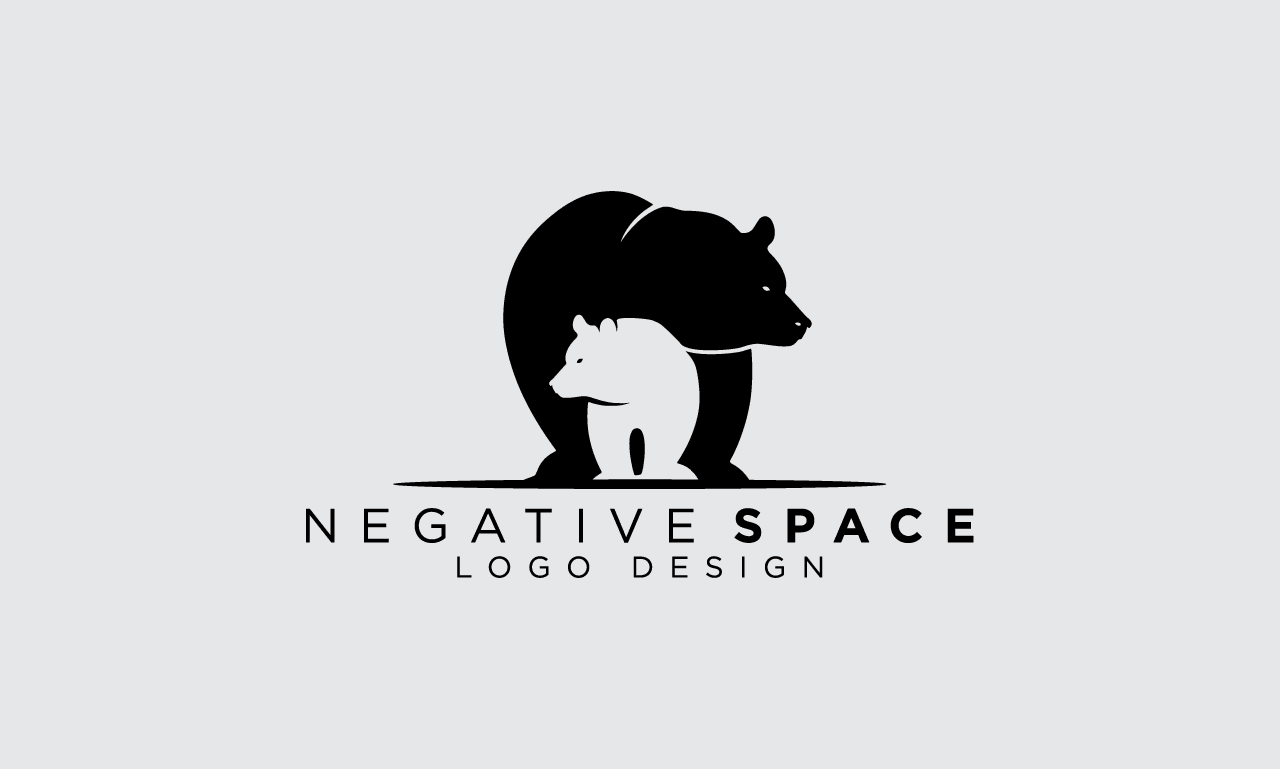
In the hands of an experienced designer, negative space becomes more than just empty background — it transforms into a storytelling tool. Negative space, the area surrounding and between design elements, allows logos to breathe and subtly communicate hidden meanings. Think of the FedEx logo, where the white space between the “E” and “x” forms an arrow, symbolizing speed and direction — a perfect example of thoughtful design backed by expertise.
Negative space demands both technical skill and creative insight. Designers with a deep understanding of visual hierarchy and composition know how to balance form and emptiness for maximum impact. Rather than adding complexity, the best logos simplify — using voids to highlight concepts or reinforce brand identity. This minimalist approach not only elevates the aesthetic but also enhances recognition and memorability.
Trustworthy brands often embrace subtlety, and negative space reflects that restraint. It’s a design choice that respects the viewer’s intelligence, rewarding attention to detail. By turning absence into presence, designers create logos that invite a second look — and in branding, that moment of intrigue is priceless.


