


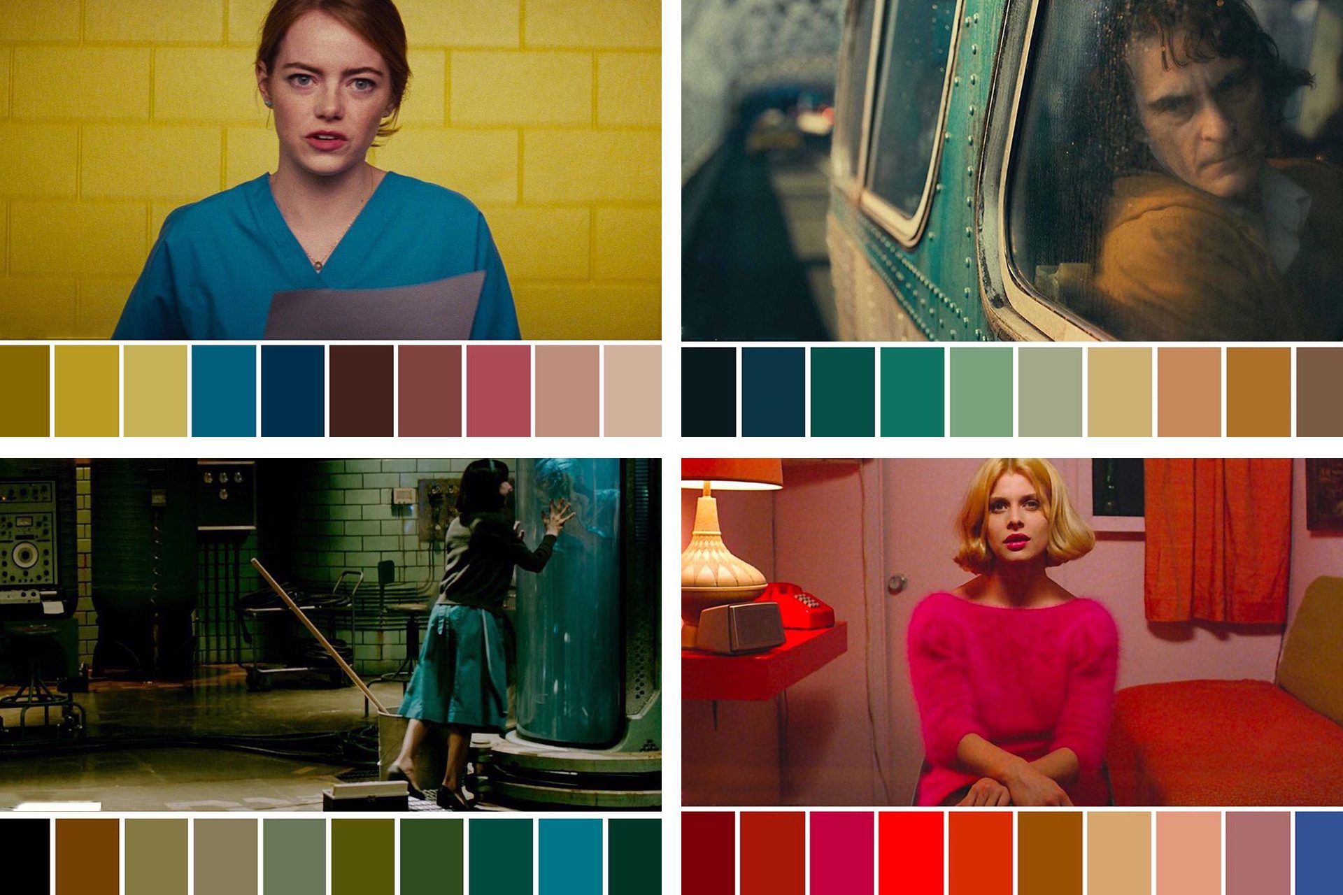
In the realm of psychological thrillers, color grading serves as a powerful storytelling device that subtly manipulates audience emotions and perceptions. Filmmakers employ desaturated palettes, cool tones, and stark contrasts to evoke feelings of unease, tension, and ambiguity. For instance, the use of muted blues and grays can create a cold, detached atmosphere, reflecting a character’s isolation or internal conflict. This deliberate color manipulation enhances the narrative by aligning the visual tone with the psychological states of characters, thereby immersing viewers deeper into the story’s suspenseful fabric.
A notable example is David Fincher’s “Gone Girl,” where the subdued color scheme mirrors the film’s themes of deception and moral ambiguity. The consistent use of cool tones throughout the movie accentuates the protagonist’s emotional detachment and the underlying tension in relationships. Similarly, in “Shutter Island,” Martin Scorsese utilizes a washed-out color palette to blur the lines between reality and delusion, effectively placing the audience in the protagonist’s disturbed psyche. These choices are not merely aesthetic but are integral to the storytelling, influencing how viewers interpret and emotionally respond to the narrative.
Understanding the role of color grading in psychological thrillers is essential for both filmmakers and audiences. It demonstrates how visual elements can be meticulously crafted to support and enhance the psychological depth of a story. For aspiring filmmakers, mastering color grading techniques can be a powerful tool in conveying complex emotional landscapes and themes. For viewers, recognizing these visual cues can lead to a more nuanced appreciation of the genre’s intricacies. Ultimately, color grading transcends mere visual appeal, becoming a subtle yet profound language that communicates the unspoken tensions and emotions within psychological thrillers.